I went to Masterpieces of the Renaissance from the Musée du Louvre at The National Art Center, Tokyo expecting to spend most of my time with paintings.
Instead, I kept stopping in front of the Renaissance portrait medals, which brought to mind the portraits and symbols on historical coins.
The exhibition brings together more than fifty works around four themes: travel, technical innovation and refinement, interest in antiquity, and the development of portraiture.
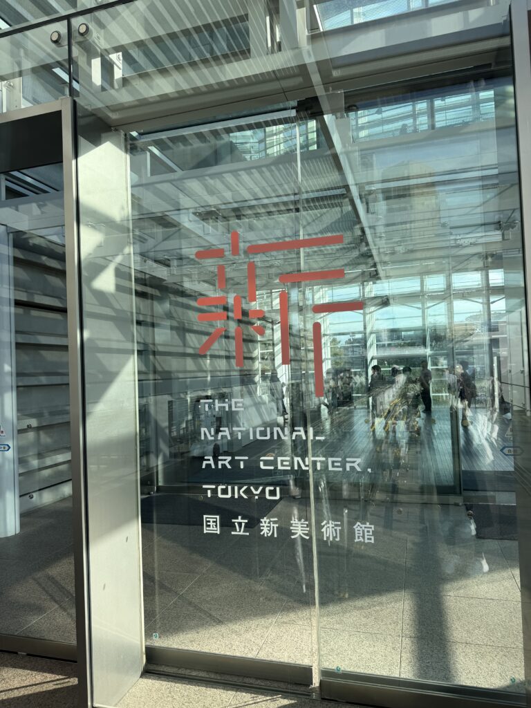
As someone who works with historical coins, the Renaissance portrait medals felt strangely familiar.
They are not coins.
But the way they communicate offered a useful way to look again at coins.
A portrait on one side, a story on the other
often tell us two different things at once.
A monarch’s portrait identifies the ruler. Turn the coin over, and another layer appears: national identity, mythology, authority, continuity, victory, or an ideal the state wished to present.
A 2017 British Sovereign shows this visual structure: a royal portrait on the obverse, with St George and the Dragon on the reverse.
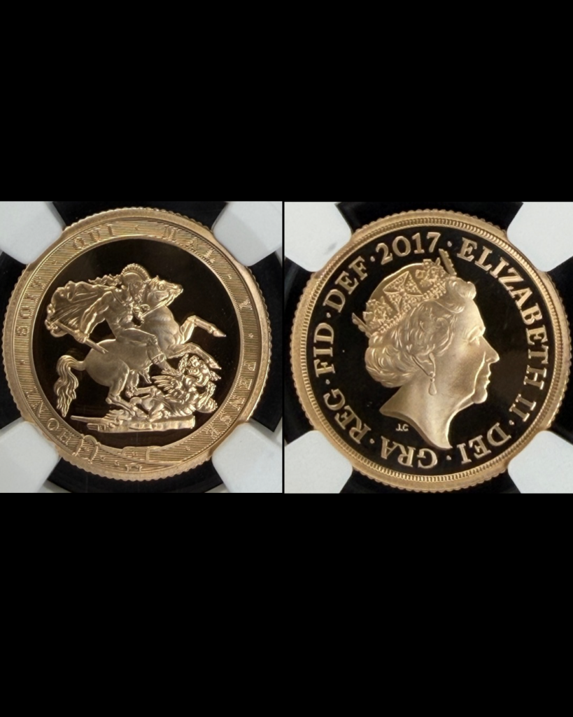
FALJU COINS selected this piece for the modern Sovereign’s 200th anniversary and the portrait of Queen Elizabeth II carrying its history forward.
For the 2017 proof issue, the early reverse design returned, including the Garter surrounding St George and the Dragon.
What interests me is the pairing: a design first used under George III appears alongside the portrait of Elizabeth II, two hundred years later.
The reverse carries the tradition forward, while the portrait shows the passage from one monarch to another.
The portrait medals in the exhibition use a similar approach.
The front tells us who the person is.
The reverse can tell us what mattered to them, what they represented, or how they wanted to be remembered.
One medal that stayed with me was the 1447 medal of Cecilia Gonzaga.
Her profile appears on the front. On the reverse, a female figure is shown with a unicorn.
Visually, it immediately made me think of Una and the Lion.
There is no direct historical connection between the two designs.
What interested me was the method itself: a human figure and an animal placed together to express something that a portrait alone cannot.
The medal of Ludovico Sforza works differently: his portrait appears on the front, while the reverse shows a cavalry procession passing before a seated ruler.
Here too, the portrait identifies the person, while the reverse suggests how that person wished to be understood.
That relationship between portrait and symbol is one of the reasons I find historical coins so interesting.
A shared visual language
Coins had existed for many centuries before the Renaissance.
Renaissance portrait medals drew on the visual language of ancient coins, including profile portraits, inscriptions, and symbolic reverse designs.
They were commemorative objects rather than circulating money.
So the connection between medals and coins is not a simple line of development.
It is a shared visual language.
And seeing that language at a much larger scale made it easier to read.
Scale, metal, and presence
The size surprised me first.
Some of the medals felt almost sculptural compared with the coins I handle every day.
They did not feel like objects made to move repeatedly from hand to hand.
They felt made to be seen.
That difference in scale changes the experience completely.
Material does too.
I usually work with gold and silver, so bronze felt much quieter.
It does not catch the light in the same way. Instead, I found myself looking more closely at the relief, depth, and surface.
Gold and silver bring their own visual associations with value.
Bronze lets the modeling and texture come forward differently.
Neither is better.
But material changes how we read an object.
The same is true of coins.
Metal, relief, surface, and scale are not separate from the design.
They are part of it.
Looking at a person, reading a person
Near the end of the exhibition is Leonardo da Vinci’s Portrait of a Woman, often known as La Belle Ferronnière.
What struck me was how little it initially felt like a portrait from more than five hundred years ago.
The clothing belongs to its period, but the composition does not depend on elaborate symbols of rank.
Against the dark background, the face comes forward first.
The body, head, and gaze do not point in exactly the same direction, which makes the sitter feel less like a fixed emblem and more like a person.
After spending time with the medals, the contrast felt especially clear.
With this painting, I found myself looking at a person.
With the medals, I found myself reading a person through symbols.
Historical coins can do both.
Objects travel, and meanings move with them
Travel is also one of the exhibition’s central themes.
People, techniques, images, and objects crossed regions, meeting different cultures along the way.
Their meanings did not always remain exactly the same.
Historical coins continue that journey.
They move across countries, collectors, and generations, carrying with them portraits, symbols, materials, and the values of the world in which they were made.
Seeing Renaissance medals in Tokyo made that especially clear.
An object may begin in one place and one moment in history.
But the way it is seen can continue to change.
A small object can hold a large story
Historical coins are small.
That does not mean the ideas inside them are small.
A portrait can tell us who.
A reverse can tell us what mattered.
The metal, scale, and surface tell us something about how the object was meant to be seen.
Together, they leave a small record of a much larger world.
A ruler.
A symbol.
An ideal.
A material.
A political message.
A moment in history.
Sometimes, all we have to do is turn it over.
Art and history, held in your hands.
FALJU COINS
Curated in Tokyo.
コインの肖像と象徴|ルーヴル美術館展2026
国立新美術館で開催されている「ルーヴル美術館展 ルネサンス」。
絵画を中心に見るつもりで訪れたのですが、実際に何度も足を止めたのは、ルネサンス期の肖像メダルでした。その表現から、歴史的なコインの肖像や象徴を思い出しました。
展覧会では、ルーヴル美術館の所蔵品50点余りが、「旅」「技法の革新と洗練」「古代へのまなざし」「肖像芸術の隆盛」という4つのテーマで紹介されています。
普段コインを扱っている私には、肖像メダルの表現方法がどこか馴染みのあるものに見えました。
もちろん、メダルはコインではありません。
ただ、そこに使われている「伝え方」が、コインを改めて見る手がかりになりました。
表に人物、裏に物語
歴史的なコインは、表と裏で違うことを伝えています。
君主の肖像がその人物を示し、裏面には国家、神話、権威、継承、勝利、理想など、別の意味が置かれる。
2017年の英国ソブリン金貨も、表にはエリザベス2世の肖像、裏にはセント・ジョージと竜が刻まれています。
表と裏を合わせて初めて、一枚の中にある物語が見えてきます。
モダン・ソブリンの200周年という節目と、その歴史を受け継ぐエリザベス2世の肖像に惹かれ、FALJU COINSにて選定した一枚です。
2017年のプルーフ版では、セント・ジョージと竜をガーターが囲む、初期の裏面意匠が復刻されています。
私がおもしろく感じるのは、その組み合わせです。ジョージ3世の時代に使われた意匠が、200年後、エリザベス2世の肖像とともに刻まれている。
裏面には受け継がれる伝統があり、肖像には君主の移り変わりが表れています。
展示されていた肖像メダルにも、似た表現が見られました。
表には、その人物が誰なのか。
裏には、その人物が何を大切にしていたのか、何を象徴しているのか、あるいは、どのような人物として記憶されたいのか。
特に印象に残ったのが、1447年のチェチリア・ゴンザーガのメダルです。
表には彼女の横顔。
裏には、女性像と一角獣が表されています。
この構図を見た時、視覚的に《ウナとライオン》を思い出しました。
もちろん、両者に直接の歴史的なつながりがあるという意味ではありません。
人物だけでは伝えきれないものを、動物や象徴と組み合わせて表現する。
その方法そのものがおもしろく感じました。
ルドヴィコ・スフォルツァのメダルでは、表に本人の肖像、裏には騎兵の行列と、玉座に座る人物が表されています。
ここでも、肖像で「誰なのか」を示し、裏面では「その人物をどう理解してほしいのか」を伝えています。
こうした肖像と象徴の関係も、歴史的なコインをおもしろく感じる理由のひとつです。
肖像と象徴に共通する表現
貨幣はルネサンスよりはるか以前から存在していました。
ルネサンスの肖像メダルは、古代の貨幣に見られる横顔の肖像や銘文、象徴的な裏面表現から影響を受けています。
メダルは流通する貨幣ではなく、人物や出来事を記念するためのものでした。
コインとメダルの関係は、どちらかがどちらかへ単純に発展した、というものではありません。
共通しているのは、肖像と象徴を使って意味を伝える「視覚の言語」です。
大きさと素材が変える印象
実物を見て最初に驚いたのは、大きさでした。
普段手にしているコインと比べるとかなり大きく、レリーフも強い。
手の中で使うものというより、「見せるためのもの」に近く感じます。
もう一つ印象的だったのが素材です。
普段は金貨や銀貨を見ることが多いので、ブロンズはかなり静かに見えました。
金や銀のように光そのものが先に目に入るというより、表面の深さやレリーフへ目が向きます。
金や銀には、素材自体が持つ価値や華やかさがあります。
一方でブロンズは、形や彫りそのものをより意識させる。
どちらが上ということではなく、素材が変わるだけで、その物の受け取り方も変わります。
コインでも同じです。
金属、レリーフ、表面の状態、大きさ。
それらはデザインとは別の条件ではなく、デザインの一部です。
人を見る肖像、人を読む肖像
展覧会の終盤に、レオナルド・ダ・ヴィンチ《女性の肖像》、通称《美しきフェロニエール》があります。
実物を前にして最初に思ったのは、500年以上前の人物なのに、思っていたほど「古い肖像」に見えないことでした。
服装はもちろん当時のものです。
それでも黒い背景の中で、最初に目へ入るのは装飾ではなく顔でした。
身体、頭、視線が完全に同じ方向を向いていないため、静止した記号というより、一人の人間がそこにいるように感じます。
メダルを見た後だったからこそ、その違いもはっきりしました。
この絵画では、人そのものを見ているように感じました。
メダルでは、人を象徴から読んでいるように感じます。
そして歴史的なコインには、その両方があります。
物が移動すると、意味も動く
今回の展覧会では、「旅」も大切なテーマのひとつです。
人や技術、図像、物は土地を越えて移動し、その過程で別の文化と出会います。
同じ物でも、置かれる場所や時代が変われば、見え方や意味も少しずつ変わっていきます。
歴史的なコインも同じです。
国境や所有者、世代を越えて移動しながら、その時代の肖像や象徴、素材、価値観を現在まで運んでいます。
東京でルネサンスのメダルを見ていること自体も、その長い移動の延長にあるように感じました。
物はある時代、ある場所で生まれます。
でも、その物がどう見られるかは、その後も変わり続けます。
小さな物の中に残る、大きな時代
歴史的なコインは小さい。
でも、小さいから情報が少ないわけではありません。
肖像から「誰なのか」が分かる。
裏面から「何を伝えたかったのか」が見える。
素材や大きさ、表面からは、その物がどのように見られることを意識して作られたのかも見えてきます。
人物。
象徴。
理想。
素材。
政治的なメッセージ。
そして、その時代。
小さな歴史的オブジェクトには、その大きさ以上のものが残されています。
表だけでは分からないことも、裏返すと見えてくる。
Art and history, held in your hands.
手のひらに収まる、歴史と芸術。
FALJU COINS
Curated in Tokyo.